A Guide to US Resume Formatting Rules
Master US resume formatting rules with this guide. Learn the layout, fonts, and ATS tips you need to build a resume that gets noticed by US hiring managers.

Following the correct US resume formatting rules is the first step toward impressing American hiring managers. It's about presenting your career story in a clean, scannable way that recruiters—and the software they use—can understand instantly. A well-formatted resume shows you're a professional who understands the specific expectations of the US job market, making it a non-negotiable part of your application. Think clarity, simplicity, and immediate impact.
The Blueprint for a Perfect US Resume Layout

Think of your resume's layout as the architectural plan for a house. A solid, logical structure guides the reader's eye, makes key information easy to find, and just feels professional. For roles in the US, this blueprint is non-negotiable. Recruiters often spend just a few seconds on their initial scan, so you have to make those seconds count.
Getting this foundation right means sticking to a few universal standards. These aren't just suggestions; they're the unspoken rules of the American job market.
Setting Your Margins and Alignment
The industry standard for resume margins is one inch on all four sides. This isn't just about looking neat; it creates white space that prevents the page from feeling cramped and overwhelming. White space is your friend—it makes the document easier to read and helps your most important achievements pop.
Always left-align your main body text. It's how we're used to reading in English, and it makes scanning your experience a breeze for recruiters. Avoid justifying your text, as it can create strange, distracting gaps between words. For a deeper dive on structuring these elements, you can find more detail on effective resume layouts on our blog: a comprehensive guide to effective resume layouts.
Essential Contact Information
Your contact details need to be clean, professional, and impossible to miss at the top of the page. Unlike in some other countries, US resume formatting rules are very specific about what you should and should not include.
- What to Include: Your full name, city and state (your full street address isn't necessary anymore), a professional email address, your phone number, and a link to your LinkedIn profile.
- What to Leave Out: A photograph, your date of birth, marital status, or any other personal detail that could lead to discrimination. This is a critical rule in the US and ignoring it is a major red flag.
Adhering to these contact information standards shows you understand professional norms in the US market. It's a small detail that instantly tells recruiters you've done your homework.
Paper Size and Practical Application
Always format your document for the standard US Letter paper size, which is 8.5 x 11 inches. Using A4 or another size might seem minor, but it can cause printing and formatting headaches, especially when an Applicant Tracking System (ATS) tries to process it.
For a great walkthrough on putting these rules into practice, check out this guide on how to make a resume on Google Docs. Nailing these fundamental layout rules ensures your resume starts on the right foot, ready to get past both human and digital gatekeepers.
To make this even easier, here's a quick checklist you can use to review your resume right now.
US Resume Core Formatting Checklist
| Formatting Element | US Standard Guideline | Why It Matters |
|---|---|---|
| Margins | One inch on all four sides. | Creates readable white space and a professional look. |
| Alignment | Left-align body text. Avoid justifying. | Ensures easy scanning for recruiters and prevents awkward word spacing. |
| Contact Info | Name, City/State, Phone, Email, LinkedIn URL. | Provides all necessary professional details without risking discrimination. |
| Personal Details | Exclude photo, age, marital status, etc. | Aligns with US anti-discrimination laws and professional standards. |
| Paper Size | US Letter (8.5 x 11 inches). | Prevents formatting errors when printed or scanned by an ATS. |
Following these guidelines isn't about stifling creativity; it's about making sure your skills and experience are the first things a recruiter notices, not a formatting error.
Is your resume actually getting responses?
Your resume might be missing something important
Upload your resume → see its weakest areas → fix them, one by one.
Free. Takes less than 2 minutes.
Choosing a Resume Format That Tells Your Story
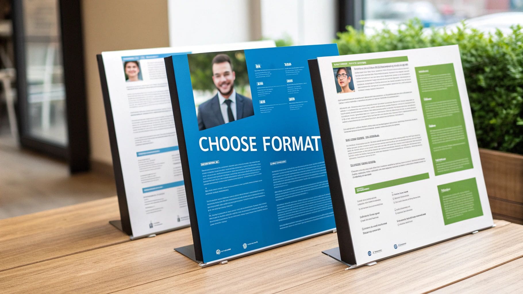
Think of your resume format as the narrative structure for your career. It's not just a template; it's the framework that guides a recruiter through your professional journey. Picking the right one is a cornerstone of effective US resume formatting rules because it dictates what they see first and how they interpret your story.
In the United States, your choice generally boils down to three core formats. Each one is designed for a different career situation, and making the right call ensures your biggest strengths are impossible to ignore.
The Gold Standard: The Reverse-Chronological Format
For the vast majority of professionals, the reverse-chronological format is the undisputed champion. It's simple: you list your work experience starting with your most recent job and work your way backwards. US recruiters love this style because it gives them a crystal-clear timeline of your career progression.
This format is your best bet if you have a solid work history without any major gaps in employment. It lets a hiring manager quickly see what you've been doing recently and trace a logical path to the role you're applying for. Its clarity and familiarity make it a safe and powerful choice in almost any industry.
This preference isn't just a US phenomenon. In the UK job market, the reverse-chronological CV is also the most accepted style, where a staggering 68% of hiring managers admit to rejecting candidates over poor formatting alone.
The Functional Format: A Skills-First Approach
But what if your career path looks more like a jungle gym than a ladder? Enter the functional resume format. This style, sometimes called a skills-based resume, shifts the spotlight away from your work timeline and puts it directly on your abilities.
Instead of a detailed work history at the top, you lead with robust skills sections, grouping your accomplishments under headings like "Project Management" or "Content Strategy." This can be a brilliant move if you're changing careers, have significant employment gaps, or your most relevant experience isn't your most recent. It lets you showcase transferable skills that might otherwise get lost.
A word of caution, though. Some US hiring managers are skeptical of the functional format because it can sometimes feel like it's hiding something about a candidate's work history. Use it thoughtfully, and only when your skills truly tell a more compelling story than your timeline.
The Combination Format: The Best of Both Worlds
Finally, we have the combination format, a potent hybrid that merges the best of the other two styles. It typically kicks off with a strong summary or skills section to immediately highlight your top qualifications, followed by a more streamlined reverse-chronological work history.
This approach is perfect for highly specialized professionals, senior-level candidates, or anyone with a diverse skill set they need to feature alongside a strong, consistent work history. It gives you the flexibility to showcase deep expertise while still providing the clear career narrative that recruiters expect. To see these styles in action, you can explore more examples in our comprehensive guide on resume formats.
How to Beat the Resume Robots (ATS)

Before a hiring manager ever sees your resume, it's almost guaranteed to face a digital gatekeeper first. This is the Applicant Tracking System, or ATS, and you can think of it as a strict but simple-minded bouncer for your career. If your resume doesn't look right to the software, you're not getting past the front door.
These systems are designed to do one thing: scan, sort, and rank candidates by looking for specific keywords, skills, and job titles. If the ATS can't read your document because of weird formatting, it essentially throws it in the bin. This is precisely why overly creative resume designs often backfire.
Keeping Your Format Clean and Simple
The golden rule for getting past an ATS is simplicity. These systems are programmed to read predictable layouts, and while fancy graphics might look great to the human eye, they can completely confuse the software.
To make sure your resume gets through, you have to sidestep a few common formatting traps:
- Columns and Tables: An ATS often reads from left to right across the page, which means it will jumble the text from your columns into a meaningless mess. Stick to a clean, single-column layout.
- Graphics and Images: Logos, charts, skill bars, and photos are unreadable to most systems. Even worse, they can cause parsing errors that get your resume immediately rejected.
- Unusual Fonts: Stick with universally recognized, sans-serif fonts like Calibri, Arial, or Georgia. A font size between 10 and 12 points is perfect for readability.
This isn't just a US problem, either. The rise of Applicant Tracking Systems in UK recruitment has forced a similar shift towards keyword optimization and clean layouts. Industry reports estimate that as many as 75% of resumes are rejected by an ATS simply because of formatting issues or a lack of relevant keywords.
Using Keywords and Standard Headings
The ATS ranks your resume by matching words and phrases from the job description to the text in your document. Your job is to make this as easy as possible. Comb through the job posting and weave the most important skills and phrases naturally into your work experience bullet points.
It's also crucial to use standard, universally understood section headings. The ATS is programmed to look for specific titles to categorize your information correctly.
Sticking to conventional headings like "Work Experience," "Education," and "Skills" is a critical strategy. Creative titles like "My Professional Journey" or "Where I've Learned" may sound interesting but will likely be ignored by the software, rendering that entire section invisible.
Choosing the Right File Type
The final step is saving your document in a format that every system can read. This is where the old PDF vs. .docx debate comes in, but there's a clear best practice.
While a PDF is great at preserving your formatting exactly as you designed it, some older ATS platforms can struggle to parse them correctly. A .docx file, on the other hand, is universally readable by virtually all systems, making it the safest bet.
Always check the job application instructions first. If they don't specify a file type, submitting a .docx minimizes your risk of being filtered out for technical reasons. For more guidance on building a document that beats the bots, you might be interested in our guide on creating a perfect ATS resume template.
Building Your Core Resume Sections

Think of a great resume as a well-told story. Each section is a chapter, building on the last to paint a clear, powerful picture of your professional journey. To make that story compelling, every component must be crafted to meet specific US resume formatting rules. This ensures your document isn't just readable, but truly persuasive.
Your resume is your number one marketing tool. Getting these essential sections right is the key to making a strong case to any employer, so let's break down how to build each one to US standards.
The Contact Information Header
First impressions matter, and your contact information is the very first thing a recruiter sees. It needs to be professional, accurate, and dead simple to find. Park it right at the top of the page where it can't be missed.
- What to Include: Your full name, city and state, a professional email address, your phone number, and a link to your polished LinkedIn profile.
- What to Leave Out: In the US, you should never include a photograph, your age or date of birth, or your marital status. Including these can get your resume tossed immediately to avoid any hint of discrimination.
The Professional Summary or Objective
Right under your contact details, you need a hook. Your professional summary is a sharp, two-to-three-sentence pitch highlighting your best skills, biggest achievements, and career goals. It's absolutely crucial to tailor this to the specific job you're applying for.
For those just starting out, an objective statement can do the trick. But for almost everyone else, a summary packed with key achievements is far more powerful.
Think of your summary as the trailer for your career movie. It should be exciting enough to make the hiring manager want to see the whole film—the rest of your resume.
The Work Experience Section
This is the heart of your resume, where you prove you can do the job. It must follow a strict reverse-chronological order, starting with your current or most recent role. Following the standard US resume formatting rules here is non-negotiable for clarity.
For each position, list your job title, the company name and its location, and the dates you worked there. The standard US format is Month Year (e.g., May 2021 – August 2023).
Under each role, use bullet points to showcase your accomplishments, not just list your duties. Frame your achievements using the CAR (Challenge-Action-Result) framework to show tangible results. For example, instead of saying "Managed social media," write something like, "Increased social media engagement by 45% by implementing a new content calendar."
The Education and Skills Sections
Finally, we have the education and skills sections. Your education should also be in reverse-chronological order, with your most recent degree listed first. Include the degree name, the university, and its location. For a deeper dive, check out our guide on how to properly list education on a resume.
Your skills section should be a clean, scannable list of your most relevant hard and soft skills. Make it easy for recruiters by grouping them into categories like "Technical Skills" or "Languages." This kind of thoughtful organization shows you're not just qualified, but also strategic.
Getting Your Resume Length Just Right
Deciding how long your resume should be is one of the most hotly-debated topics in US resume formatting. Think of your resume like a billboard on a busy motorway—you've got only a few seconds to make an impression. If it's too cluttered or drags on for too long, the driver—in this case, the hiring manager—speeds right past without a second thought. The goal is always maximum impact in minimum space.
This is exactly why the one-page rule is king in the US job market. For almost any professional with less than ten years of experience, a single, powerful page is the undisputed standard. It's not just about saving paper; it forces you to be ruthless in your editing, prioritize your absolute best achievements, and show respect for the recruiter's time. A tight, one-page resume sends a clear message: you know how to communicate effectively and can zero in on what truly matters.
When Is a Two-Page Resume Okay?
Of course, rules are made to be broken—but only for the right reasons. A two-page resume is perfectly fine, and sometimes even necessary, in a few specific scenarios.
This generally applies to:
- Senior Executives: If you have over a decade of high-level, relevant experience, you'll likely need more room to detail your leadership journey and significant accomplishments.
- Academics and Scientists: These fields often come with long lists of publications, research grants, patents, or presentations that simply won't fit on one page.
- Technical Professionals: For some highly specialized tech roles, a detailed breakdown of projects, tools, and certifications is essential and often requires a second page.
Even if you fall into one of these camps, your most critical, attention-grabbing information must live on the first page. The second page should be packed with equally valuable content, not just the leftovers.
The core principle never changes: every single word has to earn its spot. A two-page resume is only acceptable when the content is so compelling that cutting it would genuinely weaken your application.
Mastering Content Density
Beyond the page count, great US resume formatting is all about content density—the art of saying more with fewer words. It's about making every single line count.
A great place to start is by swapping passive phrases for punchy action verbs and trimming away filler words. For example, instead of writing, "I was responsible for managing the team," just say, "Managed a team of five." It's shorter, stronger, and more direct.
Striking the right balance with your word count is also key. While based on a UK study, the findings tap into a universal truth. The data showed that resumes containing between 450 and 600 words had the highest success rates. This highlights just how important it is to be detailed without being long-winded. To see this principle in action, checking out the best examples of a resume can give you some clear, actionable ideas for your own document.
Answering Your Most Common US Resume Questions
Even after you've nailed the main sections, a few tricky questions always seem to pop up. Getting these details right is what separates a good resume from a great one, giving you the confidence that a small mistake won't derail your chances. Let's tackle some of the most common uncertainties that job seekers run into.
One of the biggest questions we hear is about photos. In the United States, you should absolutely not put a photo on your resume. US anti-discrimination laws are incredibly strict, and employers go out of their way to avoid anything that could lead to claims of bias based on age, race, or appearance. Including a photo is a major cultural misstep and will almost certainly get your application tossed aside.
Font Choices and Readability
So, what's the best font and size for a US resume? The golden rule is to prioritize clarity and professionalism. You want to stick with highly readable, ATS-friendly fonts that look sharp both on-screen and when printed.
A few safe and effective choices include:
- Calibri
- Arial
- Helvetica
- Georgia
- Times New Roman
For your main body text, use a font size between 10 and 12 points. You can make your name and section headings a little larger—say, 14-16 points—and bold them to create a clear visual hierarchy. This simple tweak makes the document much easier for a recruiter to scan in those crucial first few seconds. It's a small part of the US resume formatting rules, but it has a massive impact on readability.
Handling International Experience and Other Details
How should you list international education? When you're listing degrees from outside the US, just state the institution's name, city, and country. If the degree isn't a standard one in the US, you can add its American equivalent in parentheses to provide context, like "Bachelor of Science equivalent." You generally don't need to worry about converting your GPA.
One final tip: while a perfect resume is crucial, your overall professional image matters too. Many job applicants ask about bigger-picture strategies like building an online presence that gets results. This complements a strong resume by showcasing your brand across different platforms and can be a powerful way to stand out.
Mastering these specific US resume formatting rules helps you present a polished, professional document that aligns perfectly with American hiring standards. By steering clear of common pitfalls, you make sure your skills and experience are what truly shine.
Ready to create a resume that meets every US standard and gets you noticed? The CV Anywhere Smart CV Builder helps you create polished, ATS-friendly documents in minutes. Start building for free at CV Anywhere
Tags
Related articles
How to write a resume (US version): Your Complete Guide to Landing Interviews
Knowing how to write a resume (US version) that gets results starts with a solid foundation: the format. How you structure your resume is the first, and arguably most important, decision you'll make. ...
Perfecting Your Resume Layout: A Guide for 2024
Perfecting Your Resume Layout: A Guide for 2024 A powerful resume layout isn't just about making things look nice—it's the strategic blueprint that tells a recruiter's eye exactly where to look. A gre...
How to write a CV for a job application: The Ultimate UK Guide for 2026
Learning how to write a CV for a job application in the UK is about creating a powerful, targeted sales pitch that proves your value in seconds. To do this effectively, you must start with a compellin...
How Should a CV Look in the UK for 2026?
So, how should a CV look to succeed in the competitive 2026 UK job market? The answer is a clean, professional, and easily scannable document that highlights your achievements to both automated screen...
Popular Articles
Knowing how to write a resume (US version) that gets results starts with a solid foundation: the format. How you structure your resume is the first, and arguably most important, decision you'll make. ...
Perfecting Your Resume Layout: A Guide for 2024 A powerful resume layout isn't just about making things look nice—it's the strategic blueprint that tells a recruiter's eye exactly where to look. A gre...
Learning how to write a CV for a job application in the UK is about creating a powerful, targeted sales pitch that proves your value in seconds. To do this effectively, you must start with a compellin...
So, how should a CV look to succeed in the competitive 2026 UK job market? The answer is a clean, professional, and easily scannable document that highlights your achievements to both automated screen...