Perfecting Your Resume Layout: A Guide for 2024
Discover the perfect resume layout to showcase your skills and beat ATS. Explore chronological, functional, and hybrid formats with expert tips.

Perfecting Your Resume Layout: A Guide for 2024
A powerful resume layout isn't just about making things look nice—it's the strategic blueprint that tells a recruiter's eye exactly where to look. A great structure ensures your career story is clear, compelling and ready for both human hiring managers and the Applicant Tracking Systems (ATS) that screen every application. The right format shines a spotlight on your biggest strengths whilst minimising anything that might look like a weakness, such as a gap in employment or a recent career change.
Choosing Your Resume Layout Foundation
Think of your resume layout as the architectural plan for your career. Just like a building needs a solid foundation to stand tall, your resume needs a logical structure to support your professional achievements. The right layout doesn't just list what you've done; it frames your experience in a way that's immediately compelling to a busy hiring manager.
This first decision is a big one. It sets the stage for your entire professional narrative. Your goal is to pick a format that shines a spotlight on your biggest strengths whilst minimising anything that might look like a weakness, such as a gap in employment or a recent career change.
The Three Core Layouts
Every effective resume is built on one of three foundational structures. Each one serves a distinct purpose, designed for different career stages and professional stories. Getting to know them is the first step towards building a resume that actually gets you interviews.
- Chronological: This is the classic, the one everyone knows. It lists your work history starting with your most recent job and working backward. It's perfect for showing a clear, steady career progression.
- Functional: This layout flips the script, focusing on your skills and abilities rather than a timeline. It's a smart choice for career changers, new graduates or anyone with employment gaps because it puts your transferable skills front and centre.
- Combination (or Hybrid): Just like it sounds, this layout blends the best of both worlds. It usually kicks off with a detailed skills summary, followed by a more condensed work history. It's a powerful hybrid that showcases both what you can do and where you've been.
It's no secret that the global trend is leaning towards clean, simple designs. This shift reflects a pretty stark reality: with the volume of applications per job surging by a massive 182% in the U.S. since 2021, recruiters need resumes they can scan in seconds. That means clean, ATS-friendly formats win every time.
To make this choice a little easier, we've put together a quick comparison table.
Quick Guide to Choosing Your Resume Layout
This table breaks down the three core layouts to help you quickly identify which one best aligns with your professional background and job search goals.
| Layout Type | Primary Focus | Best For |
|---|---|---|
| Chronological | Work History & Career Progression | Professionals with a consistent, linear career path in a single industry. |
| Functional | Skills & Abilities | Career changers, recent graduates or individuals with employment gaps. |
| Combination | Both Skills & Work History | Experienced professionals who want to highlight specialised skills alongside a strong work history. |
Choosing the right structure is all about playing to your strengths. Once you've picked your foundation, you can start building a document that truly represents your value.
This decision tree gives you a great visual for figuring out which path is right for you.
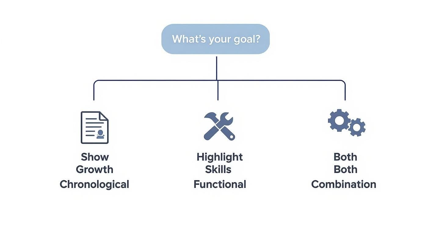
As the infographic makes clear, your main goal—whether it's showing steady growth, highlighting specific skills or doing a bit of both—directly points to the best resume layout. If you're ready to start building, be sure to check out our complete resume writing guide for more in-depth advice.
Is your resume actually getting responses?
Your resume might be missing something important
Upload your resume → see its weakest areas → fix them, one by one.
Free. Takes less than 2 minutes.
Mastering the Chronological Resume Layout

The chronological resume layout is the undisputed champion of the job market, and for a simple reason: it tells a clear, straightforward story of your career growth.
By listing your jobs in reverse-chronological order—starting with your most recent role—it creates a clean narrative that recruiters find incredibly easy to scan. This is the go-to format for most professionals because it's the best way to show a consistent career path.
The power of this layout is in its structure. It naturally highlights promotions, growing responsibilities and a steady commitment to your field. Think of each job entry as a chapter in your professional story, with the latest chapter right at the top. This makes it a breeze for a hiring manager to connect the dots and see how you've evolved, building a strong case for why you're ready for the next step.
Structuring Your Experience Section
The "Work Experience" section is the heart and soul of a chronological resume. Each entry needs to be more than a list of duties; it should be a showcase of your accomplishments. A clean, consistent format is key to making each role pop.
For every position, make sure you include these key details:
- Job Title: Your official title.
- Company Name & Location: The name of your employer and the city/state.
- Dates of Employment: The start and end month and year for the role.
- Accomplishment Bullets: Use 3-5 bullet points per job to highlight what you achieved, not just what you were told to do.
This structure gives a recruiter all the essential context they need at a glance. It's also the most Applicant Tracking System (ATS) friendly way to organise your work history.
Crafting Compelling Bullet Points
Your bullet points are where you make your case. Instead of saying what you did, you need to show what you achieved. The best way to pull this off is with the STAR method, which frames your accomplishments as tiny, powerful stories.
The STAR Method
- Situation: Briefly set the scene or describe the challenge.
- Task: Explain what you were responsible for in that situation.
- Action: Detail the specific steps you took to handle the task.
- Result: Quantify the positive outcome with numbers, percentages or concrete improvements.
For instance, don't just write "Managed social media." A STAR-powered bullet point sounds like this: "Grew social media engagement by 45% in six months by developing and executing a new content calendar focused on video." See the difference? One is a task, the other is a clear, measurable impact.
To see how this works in the real world, check out these professional resume examples that nail this technique. The right resume layout paired with strong, action-oriented language is what gets you noticed.
When a Chronological Resume Just Won't Cut It
Whilst the reverse-chronological format is the go-to for most people, it's not a one-size-fits-all solution. Forcing your career into a rigid timeline can sometimes bury your best assets, especially if your path hasn't been a straight line from A to B.
This is where a strategic shift in your resume layout becomes your secret weapon. When the standard approach doesn't do you justice, the functional and hybrid layouts offer smarter ways to frame your value, ensuring a hiring manager sees what you can do before they get lost in the when and where.
The Functional Layout: All About Your Skills
Think of the functional resume layout as a powerful spotlight. Instead of illuminating your job history step-by-step, it shines directly on your core abilities. This layout pushes your work timeline to the background and dedicates the prime real estate at the top of the page to a detailed skills summary.
This approach is a game-changer in a few specific situations:
- Career Changers: Pivoting from marketing to software development? Your old job titles might just confuse a recruiter. A functional layout lets you lead with rock-solid skills like "Python Programming" or "Agile Methodologies" instead of an unrelated "Marketing Manager" role from five years ago.
- Professionals with Employment Gaps: If you've taken time off to raise a family, travel or recover from an illness, this layout masterfully shifts the focus away from the timeline gap and onto the skills you're ready to put to work right now.
- Recent Graduates: When your formal work history is thin, a functional resume lets you highlight valuable academic projects, internships and certifications to build a compelling case for your potential.
This layout gets straight to the point, answering the recruiter's most important question first: "What can you do for my company?" By front-loading your abilities, you immediately show them you're a problem-solver.
A quick word of caution: some old-school recruiters can be a bit suspicious of this format, as it can be used to hide a choppy work history. But when used honestly, it's an incredibly effective tool for telling the right story.
The Hybrid Layout: The Best of Both Worlds
The hybrid (or combination) resume layout is exactly what it sounds like—it merges the best of the functional and chronological formats. It kicks off with a detailed, high-impact skills or qualifications summary, then follows it up with a more traditional reverse-chronological work history.
This balanced approach is perfect for experienced professionals, especially in technical fields where a diverse and specific skillset is everything.
Imagine you're a senior data scientist. You can use the top section to create a quick, scannable checklist of your core competencies: Python, R, SQL, TensorFlow, AWS SageMaker. A technical hiring manager can instantly see you have what it takes before they even glance at the companies you've worked for.
For a clear idea of how to bring skills and experience together, see the best example of a resume that nails this balanced approach.
Designing a Resume That Gets Noticed

A winning resume layout does more than just organise your history; it's a strategic design that guides a hiring manager's eye straight to your biggest wins. The best resumes are clean, professional and unbelievably easy to scan. They have to be—you only have a few seconds to make an impression. This is where basic design principles become your secret weapon.
Think of your resume like a storefront window. If it's cluttered and disorganised, people—in this case, recruiters—will walk right on by. Your goal is to create a presentation so clean and inviting that they can't help but step inside to learn more.
Harnessing the Power of White Space
One of the most powerful tools in your design arsenal is something you can't even see: white space. This is just the empty area around your text and between sections, but it's absolutely essential for readability. A resume crammed with words from margin to margin is an instant turn-off.
Ample white space gives the document room to breathe. It makes your content feel organised and approachable, not intimidating. By separating your work experience from your skills, you're helping the reader's brain process information in logical, digestible chunks. For creative fields where presentation is everything, mastering this is non-negotiable. This Video Editor Resume Business Guide is a great example of how these principles are applied in the real world.
The right resume layout doesn't just present information; it creates focus. By using white space, you're telling the reader, "Look here, this part is important."
Choosing Fonts and Establishing Hierarchy
Typography has a huge impact on how your resume feels. Your font choice needs to be professional, clean and easy to read on any screen. The last thing you want is for your resume to look garbled because a recruiter's computer doesn't have your obscure font. Stick to the classics.
- Serif Fonts (with small decorative strokes): Georgia, Garamond and Times New Roman are excellent choices that give off a traditional, authoritative vibe.
- Sans-Serif Fonts (without strokes): Calibri, Arial and Helvetica offer a clean, modern look that's especially easy to read on screens.
Once you've picked a font family, you need to create a clear visual hierarchy with font sizes. For instance, your name could be 20-24pt, section headings 14-16pt and your main body text a readable 10-12pt. This simple consistency is what guides the reader's eye through the page logically. Mastering a modern format for your resume often comes down to getting these simple typographic rules right.
Finally, use simple tools like bold text and bullet points to make your key achievements pop. Bolding a key metric or breaking down your accomplishments into a scannable list makes them jump off the page. It creates a document that is both effective and easy on the eyes.
How to Create a Resume Layout That Gets Past the Bots

Let's pull back the curtain on modern hiring. Before your resume ever lands in front of a human, it's almost guaranteed to be scanned by an Applicant Tracking System (ATS). Think of it as a digital bouncer, programmed to find specific keywords and qualifications. If your resume layout confuses this system, you get bounced—no questions asked.
This is where a little strategy goes a long way. To get past the gatekeeper, you have to design for the bot first, human second. These systems are smart, but they're not clever. They read top-to-bottom, left-to-right and get completely tripped up by complex formatting like tables, columns or even text boxes. Even something as simple as a fancy font or putting key info in the header can cause a parsing error, turning your experience into digital gibberish.
That's why a clean, almost boring resume layout is your secret weapon. It's not about stifling your creativity; it's about making sure your story gets told. If you want to get noticed, you first have to understand how to beat ATS systems.
ATS Optimisation Checklist
Keeping your resume readable for software isn't complicated. The golden rule is to avoid anything that could make a simple-minded machine stumble.
- Use Standard Section Headings: Stick to the classics: "Work Experience," "Education" and "Skills." A creative heading like "Where I've Made an Impact" sounds great to a human but is invisible to an ATS.
- Stick to Standard Fonts: Choose fonts that every computer recognises, like Arial, Calibri or Georgia. Decorative or script fonts are a surefire way to make your resume unreadable.
- Avoid Complex Graphics: This is a big one. No tables, columns, images or text boxes. These elements break the scanning process and can get your entire application thrown out.
- Save in the Right Format: Unless the job posting says otherwise, always submit your resume as a .docx or .pdf file. These are the universal standards that keep your formatting intact.
An ATS-friendly resume isn't just about dodging rejection. It's about ensuring your most valuable qualifications are correctly identified, giving you the best possible shot at moving forward.
There's a reason so many job seekers now lean on pre-built, ATS-friendly templates. The data shows that resumes created from these templates are processed up to 50% faster by screening software compared to documents with custom, complex formatting.
By simplifying your resume layout, you're not dumbing it down. You're making a calculated choice to ensure your skills actually get seen. For a deeper dive, check out our complete guide on creating an ATS-friendly resume that sails right through the front door.
Your Resume is No Longer Just a Piece of Paper
Whilst having a polished, traditional resume is still non-negotiable, the game has changed. Think of your resume not as the final product, but as the front door to your entire professional brand. In today's job market, a single page is rarely enough. Hiring managers expect to see more, and your resume layout needs to be the gateway that invites them in.
This means linking out to your digital assets is no longer a nice-to-have; it's becoming standard practice. For a developer, a link to a clean GitHub profile is immediate proof of your coding chops. For a marketer or designer, a portfolio link is your chance to show, not just tell. These digital footprints provide tangible evidence of your skills, turning the claims on your resume into verifiable accomplishments.
How to Weave Your Digital Life Into Your Resume
So, where do you put these links? Don't bury them. The best spot is right at the top in your contact information section. It's prime real estate, ensuring a recruiter sees it immediately and can click through before they even get to your work history.
Keep the links clean and professional. No one wants to type out a long, messy URL.
- LinkedIn: linkedin.com/in/your-name
- Portfolio: your-name-portfolio.com
- GitHub: github.com/your-username
This approach keeps your resume layout uncluttered and gives hiring managers a direct path to the proof they're looking for. It signals that you're a modern professional who gets how to build a comprehensive brand.
The goal is simple: make it effortless for a recruiter to go from reading about your achievements to seeing them firsthand. That simple, clickable link is the bridge between being a name on a list and becoming a candidate they need to meet.
Now, whilst the digital world is expanding, let's be real—traditional formats still dominate most industries. Here's a fascinating disconnect: a recent analysis shows 79% of hiring managers say they value video content when vetting candidates, yet only about 1% of resumes actually include links to social or digital profiles.
That gap isn't a problem; it's a massive opportunity. By thoughtfully adding these digital elements to a classic and effective resume layout, you immediately stand out from the crowd. If you want to dig deeper into these shifts, you can review more resume statistics to see where things are headed.
Got a few lingering questions about your resume layout? Good. Nailing these final details is what separates a decent resume from a great one. Let's clear up some of the most common sticking points so you can submit your application with confidence.
How Many Pages Should My Resume Be?
For the vast majority of people, the answer is simple: one page.
Think of it from the recruiter's perspective. They're sifting through hundreds of applications, and they only spend a few seconds on each one. A tight, single-page resume respects their time and proves you can communicate your most valuable achievements clearly and concisely.
Of course, there are exceptions. If you're a seasoned professional with over 10-15 years of directly relevant experience, or you work in fields like medicine or academia where a long list of publications is standard, a two-page resume is perfectly fine.
Just follow one crucial rule: make sure the second page is at least half full. A second page with only a few lines on it looks like you just couldn't edit yourself properly. And whatever you do, never go beyond two pages.
Should I Include a Photo on My Resume?
In the United States and the UK, the answer is an emphatic no.
Including a photo opens the door to unconscious bias, and many companies have policies to discard resumes with pictures to avoid any hint of discrimination. You want to be judged on your skills, experience and accomplishments—nothing else.
The only time this rule doesn't apply is if you're an actor, model or in a similar profession where your appearance is a direct job requirement. For everyone else, your resume layout should be 100% photo-free. Keep the focus squarely on your qualifications. That's what will land you the interview.
Ready to build a professional resume that gets noticed? The Smart CV Builder from CV Anywhere uses AI to create polished, ATS-friendly resumes that highlight your strengths. Start building your future for free at CV Anywhere.
Tags
Related articles
8 Actionable Resume Examples That Get Results in 2025
8 Actionable Resume Examples That Get Results in 2025 Choosing the right resume format can feel overwhelming. With countless templates and conflicting pieces of advice available, it's easy to get lost...
How to write a resume (US version): Your Complete Guide to Landing Interviews
Knowing how to write a resume (US version) that gets results starts with a solid foundation: the format. How you structure your resume is the first, and arguably most important, decision you'll make. ...
Resume Worded vs CV Anywhere: A Head-to-Head Analysis
Resume Worded vs CV Anywhere: A Head-to-Head Analysis Choosing between resume tools like Resume Worded and CV Anywhere boils down to your primary goal. This guide provides a direct comparison to help ...
10 Examples of the Best Resume Formats for 2025
10 Examples of the Best Resume Formats for 2025 Searching for a single best example of a resume can be misleading, as the perfect format depends on your industry, career stage and goals. To help you b...
Popular Articles
8 Actionable Resume Examples That Get Results in 2025 Choosing the right resume format can feel overwhelming. With countless templates and conflicting pieces of advice available, it's easy to get lost...
Knowing how to write a resume (US version) that gets results starts with a solid foundation: the format. How you structure your resume is the first, and arguably most important, decision you'll make. ...
Resume Worded vs CV Anywhere: A Head-to-Head Analysis Choosing between resume tools like Resume Worded and CV Anywhere boils down to your primary goal. This guide provides a direct comparison to help ...
10 Examples of the Best Resume Formats for 2025 Searching for a single best example of a resume can be misleading, as the perfect format depends on your industry, career stage and goals. To help you b...