The Modern Format for Resume That Gets You Hired
The Modern Format for Resume That Gets You Hired
So, what exactly is a modern format for resume? Think of it as a strategic document that pulls double duty. It needs to have a clean, compelling design for the human eye, but also a logical, machine-friendly structure for the software that reads it first.
It's built for today's hiring world, where your resume has to impress an Applicant Tracking System (ATS) before it ever gets a chance to wow a real person.
What Defines a Modern Resume
The best way to picture a modern resume is to think of it as a personal landing page. Its one and only job is to convert a visitor (the recruiter) into a lead (an interview). How? By being visually engaging, incredibly easy to navigate, and packed with the right keywords. It's not just a boring list of past jobs; it's a marketing tool designed to make a huge impact in a very short amount of time.
This graphic breaks down the foundational structures that nearly all modern resumes are built upon.
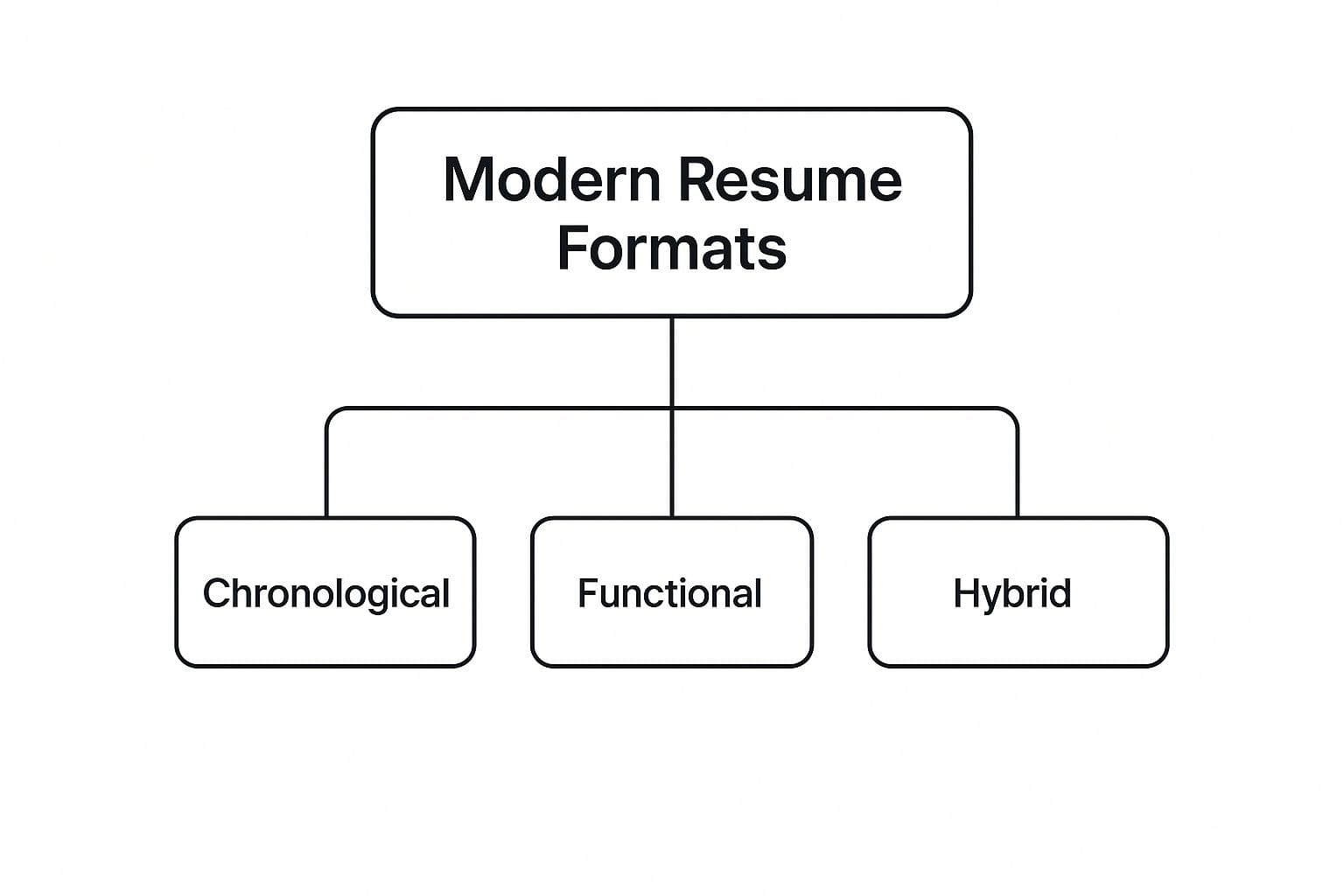
As you can see, the three core formats—Chronological, Functional, and Hybrid—are the building blocks. Each one offers a different strategic angle depending on your career story and goals.
The Shift from Past to Present
The way we format resumes didn't just change on a whim. This evolution is a direct response to huge shifts in hiring technology and recruiter behavior. Old-school, clunky styles are often instantly rejected by the automated screening systems used by most companies today, which makes adapting your format a non-negotiable.
This new reality has pushed a few key formats to the forefront, each one fine-tuned for different career levels and industries. To see how these play out, you can dive deeper into the top resume formats that will dominate the hiring scene and get a feel for what works now.
To really grasp this evolution, it's helpful to see the changes side-by-side. The old way of thinking just doesn't cut it anymore.
Key Shifts from Traditional to Modern Resumes
| Resume Element | Traditional Approach (Outdated) | Modern Approach (Effective) |
|---|---|---|
| Purpose | A comprehensive, historical record of every job held. | A targeted marketing document highlighting relevant skills and achievements. |
| Audience | Primarily written for a human reader, assuming it gets seen. | Dual-audience: First for an ATS bot, then for a human recruiter. |
| Content Focus | Listing job duties and responsibilities ("Responsible for..."). | Showcasing quantifiable results and impact ("Increased sales by 15%..."). |
| Design | Dense, text-heavy, often using generic templates (e.g., MS Word). | Clean, scannable, with strategic use of white space and simple design cues. |
| Keywords | Keywords were not a primary consideration. | Keywords tailored to the specific job description are critical for ATS screening. |
| Structure | Rigidly chronological, regardless of relevance. | Flexible formats (Chronological, Hybrid, Functional) chosen strategically. |
The takeaway is simple: a modern resume is proactive and strategic, while a traditional one is passive and historical.
Core Principles of Modern Formatting
To build a resume that actually works today, you need to ground it in a few key principles. Get these right, and your document will be both ATS-proof and recruiter-friendly.
- Clarity and Scannability: This is non-negotiable. Use a clean layout, generous white space, and a simple, legible font. A recruiter needs to absorb your key qualifications in a single glance.
- ATS Compatibility: The structure has to be simple enough for software to parse correctly. That means you need to avoid fancy tables, charts, images, and weird fonts that can trip up the bots and get your resume tossed.
- Impact-Driven Content: Instead of just saying what you did, modern resumes prove your value. They are loaded with quantifiable achievements. Use numbers, percentages, and metrics to show what you actually accomplished.
Getting a handle on the principles behind the format of modern resume documents is your first step. It's what transforms your resume from a simple historical record into a powerful tool for your job search.
Is your resume actually getting responses?
Your resume might be missing something important
Upload your resume → see its weakest areas → fix them, one by one.
Free. Takes less than 2 minutes.
The Core Components of a Modern Resume Layout
A modern resume is built from a few key sections, and each one has a specific job to do. Think of them like the essential ingredients in a recipe; getting the balance and presentation just right is what makes the final dish so compelling. The first step toward creating a document that actually grabs attention is moving past those outdated, rigid structures.

The goal here is simple: guide the recruiter's eye through a logical story of your professional value. Every component has to be optimized for two very different audiences—a real human being scanning for highlights and the software that most companies use to filter applications.
Your Professional Summary
Please, forget the old "Objective" statement that just announced what you wanted from a company. The modern professional summary is your elevator pitch. It's a tight, 2-3 sentence paragraph right at the top that immediately answers the recruiter's biggest question: "Why should I even consider you?"
This is your chance to powerfully introduce your core skills, years of experience, and a major career win. It frames the entire narrative of your resume and sets the tone for everything else they're about to read.
Actionable Tip: Lead with your professional title and years of experience. Something like, "Results-driven Digital Marketer with 8+ years of experience..." gives immediate context and establishes your credibility right out of the gate.
The Experience Section
This is the heart and soul of your resume, but it's not a laundry list of job duties. A modern format for resume writing is all about quantifiable achievements, not just responsibilities. Your goal is to show the impact you made, not just the tasks you were assigned.
The STAR method (Situation, Task, Action, Result) is a fantastic framework for crafting bullet points that pop. Lean heavily on the "Result" by using numbers, percentages, and hard metrics to prove your value.
- Weak Example: Responsible for managing social media campaigns.
- Strong Example: Managed 5 social media campaigns, boosting client engagement by 45% and generating $50,000 in attributed revenue in Q3.
See the difference? One is a passive description; the other is an active accomplishment.
The Skills Section
Just dumping all your skills into one long, jumbled paragraph is a thing of the past. A modern resume organizes them so they can be scanned in seconds. This doesn't just help the human reader; it makes it much easier for Applicant Tracking Systems (ATS) to find the keywords they're looking for.
Categorizing your skills is the way to go. By breaking them into logical groups, you make your expertise crystal clear and easy to digest. Using subheadings creates a clean, organized look that recruiters appreciate.
- Technical Skills: Python, SQL, Tableau, Google Analytics
- Languages: English (Native), Spanish (Professional Working Proficiency)
- Certifications: Certified Project Management Professional (PMP)
This structured approach prevents a recruiter's eyes from glazing over and ensures they can instantly spot the qualifications they need.
Getting these core components right is fundamental to building a resume that actually works. For a deeper look, check out our guide on how to choose the right modern resume format for your specific career path.
Choosing the Right Modern Format for Your Career
Picking the right resume format isn't just about aesthetics; it's a strategic decision. Think of it like choosing a vehicle. You wouldn't take a sports car on a rugged mountain trail, and an off-road SUV would be overkill for a smooth highway commute. Your career journey dictates the best format to get you to your next destination.
The three core modern formats—Reverse-Chronological, Hybrid, and Skills-Based—each tell your professional story in a unique way. The trick is to match your narrative to the format that plays up your strengths and downplays any weaknesses, making your value proposition crystal clear to a recruiter in just a few seconds.
The Reverse-Chronological Format: Your Steadiest Path Forward
This is the industry gold standard, and for good reason. The reverse-chronological format is straightforward, instantly familiar to hiring managers, and plays nice with Applicant Tracking Systems (ATS). It simply lists your work experience from the most recent role backward, creating a clean, linear narrative of your career growth.
Best for "The Seasoned Executive": An executive with a steady, upward career trajectory in a single industry is the perfect candidate for this format. It puts their promotions and expanding responsibilities on full display.
- Structure: It kicks off with a punchy Professional Summary, dives straight into a detailed Work Experience section, and rounds out with Skills and Education.
- Advantage: Over 90% of recruiters prefer this format. Its familiarity lets them scan it quickly and find the answer to their most pressing question: "What have you done lately?"
- Drawback: This layout makes employment gaps or a history of job-hopping impossible to hide. If your career path has a few twists and turns, this might not be your best bet.
The Hybrid Format: For a Strategic Pivot
Often called a combination format, the hybrid is a brilliant mix of the other two styles. It leads with a beefy skills section that showcases your core capabilities before getting into the chronological timeline of your jobs. This structure lets you frame the narrative on your own terms.
Best for "The Career Switcher": Imagine you're moving from marketing into data analytics. The hybrid format lets you feature your newly acquired technical skills—like Python and SQL—right at the top. You immediately look like a relevant candidate, even before they see your past job titles.
The hybrid format is your secret weapon for connecting the dots for a recruiter. It answers the question, "How is your past experience relevant to this new role?" before they even have to ask.
The Skills-Based Format: Highlighting Pure Expertise
The skills-based (or functional) format pushes your work history into the background and puts your abilities in the spotlight. It's a bold move that dedicates the most valuable real estate on the page to a detailed breakdown of your competencies, backed by tangible examples.
Best for "The Recent Graduate" or Freelancer: A new grad with fantastic internship projects but little formal job history can group their achievements under skill headings like "Project Management" or "Content Creation." This approach highlights what they can do, not just where they've been.
- Structure: This format usually starts with a Resume Objective, followed by an in-depth Skills Summary, with a condensed Work Experience section tucked away at the bottom.
- Advantage: It's a masterful way to downplay a lack of traditional work experience or significant employment gaps by focusing entirely on your transferable skills.
- Drawback: Be careful with this one. Recruiters are often wary of this format because it can be used to obscure a patchy work history. Use it only when your skills are genuinely more compelling than your timeline.
Design and Formatting Best Practices for Readability
Choosing a modern format for your resume is a great start, but it's only half the battle. How you actually design and format that content is what makes or breaks its readability. Think about it: a cluttered, hard-to-read document gets tossed aside in seconds, no matter how stellar your qualifications are. Great design is your secret weapon—it guides the recruiter's eye and makes your value instantly clear.

The goal here isn't to be flashy. Far from it. The real aim is to create a clean, professional, and accessible blueprint of your career journey. Smart, strategic choices in typography, spacing, and color can transform your resume from a dense wall of text into a scannable, persuasive marketing tool that works for you.
Mastering Typography for Scannability
The font you pick sets the entire tone of your resume. While a fancy, decorative font might feel creative, it almost always hurts readability and can trip up the Applicant Tracking Systems (ATS) that most companies use. For a modern resume, clarity and compatibility are everything.
Recent trends all point toward clean, minimalist layouts that work just as well for the ATS robots as they do for the 5-second human scan. Your font choice is critical here. For example, a staggering 80% of job seekers use Arial for a reason—it's exceptionally clear and sails right through ATS screening. Similarly, color is used sparingly, with navy blue being a popular accent to add a touch of personality without looking unprofessional.
To get the best results, just stick to these simple typography rules:
- Font Type: Always go with a sans-serif font like Arial, Calibri, Helvetica, or Verdana. They were literally designed for on-screen reading and are universally recognized by ATS software.
- Font Size: Keep your main body text between 10-12 points. You can bump up your headings to 14-16 points to create a clear visual hierarchy that guides the reader's eye.
- Consistency: Use the same font family throughout the entire document. This small detail makes a huge difference in creating a cohesive, polished look.
The Strategic Use of White Space
White space—that's the empty area around your text and other elements—is one of the most powerful (and overlooked) design tools you have. It prevents the reader from feeling overwhelmed and helps them focus on what's most important. A resume crammed with text from margin to margin is just intimidating and impossible to scan.
By using generous margins (aim for around 0.75 to 1 inch) and leaving enough space between sections, you create a clear visual pathway for the recruiter. This intentional breathing room makes your accomplishments much more digestible and helps your key achievements pop off the page.
If you're just getting started and this sounds like a lot to manage, it's a good idea to check out our guide on the best online resume builder. These tools are designed to handle all the tricky formatting details for you.
Applying Color with Intention
While modern resumes definitely allow for a splash of color, the key is subtlety. Think of it as a tasteful accessory, not the main outfit. A conservative color palette reinforces your professionalism and ensures your content remains the star of the show. Overly bright or clashing colors are distracting and often print poorly in grayscale, which many recruiters still do.
Follow these simple color guidelines and you can't go wrong:
- Primary Text: Stick with black or a very dark gray. You need maximum contrast for readability, and this is the safest bet.
- Accent Color: Choose a single, muted accent color. A professional navy blue, a deep burgundy, or a forest green works beautifully.
- Application: Use your accent color sparingly. It's perfect for elements like your name, section headers, or subtle horizontal lines to add a bit of visual flair. If you really want to make a statement, you could even consider advanced options like metallic foil printing to give your name or headers a sophisticated, tactile finish.
Seeing Modern Resumes in Action
Theory is great, but seeing how these formats work in the real world is where it all clicks. Let's break down two solid examples for different professions to see how the right choices in layout, content, and design come together.
Think of these as blueprints that show you how to build a resume that not only sails through automated screening systems but also grabs the attention of a real human.
Example 1: The Software Developer
For a technical role like a software developer, the reverse-chronological format is a perfect match. It immediately puts their most recent projects and tech accomplishments at the top of the page—exactly where a tech recruiter is going to look first.
A Clear, Confident Summary: The resume kicks off with a title like, "Senior Software Engineer with 8+ years of experience." This isn't just a title; it's an immediate declaration of seniority. It then lists key languages (Python, Java) and methodologies (Agile) that align directly with keywords from the job description.
Show, Don't Just Tell: Instead of a lazy list of duties, the experience section is all about impact. A weak resume says, "Maintained the company's software." A strong one says, "Refactored legacy codebase, improving application performance by 30% and reducing server costs by 15%." Numbers tell a powerful story.
A Well-Organized Tech Stack: The skills section isn't a jumbled mess of buzzwords. It's neatly organized under clear subheadings like "Languages," "Frameworks," "Databases," and "Tools." This simple structure lets a recruiter confirm the candidate has the required tech stack in about five seconds.
Example 2: The Marketing Manager
A Marketing Manager often wears many hats, making the hybrid (or combination) format an incredibly effective choice. It leads with a powerful skills summary that frames their expertise before the reader even gets to the chronological work history.
A hybrid format allows a marketing professional to immediately showcase their strategic value. By highlighting core competencies like "SEO Strategy," "Content Marketing," and "PPC Campaigns" at the top, they control the narrative and prove their relevance from the very first glance.
This structure is a game-changer because it highlights a broad range of capabilities that might get lost in job titles alone.
A Summary with Punch: The summary starts with a bold value proposition, something like: "Data-driven Marketing Manager with a proven record of increasing lead generation by over 200%." This immediately signals a results-first mindset.
Achievement-Focused Bullets: Every bullet point tells a mini success story. For instance, "Developed and executed a content marketing strategy that grew organic blog traffic from 10k to 75k monthly visitors in 12 months." That's not a task; it's a massive win.
A Clean, Scannable Layout: The design is professional and breathes. Typography is a huge part of this, as the right font choices make the document easy to scan and digest. To get this right, check out the best fonts for enhanced readability. This example uses plenty of white space and a single, subtle accent color for headings, creating a modern feel without being distracting.
Common Mistakes to Avoid in Your Modern Resume
Crafting the perfect modern resume is as much about dodging the common landmines as it is about highlighting your strengths. It's a frustrating truth, but even the most qualified person can get sidelined by simple, preventable errors that send all the wrong signals to recruiters and their software.
Getting a handle on these common mistakes is the first step. Think of them less as minor slip-ups and more as strategic blunders that can stop your job search dead in its tracks. Let's make sure that doesn't happen.
Overlooking Typos and Grammatical Errors
This one sounds so obvious, yet it remains the number one reason resumes get tossed. A typo isn't just a simple mistake; to a hiring manager, it's a glaring red flag for a lack of attention to detail—a critical skill in pretty much every job.
Your resume is your professional marketing document. Errors scream that you either didn't care enough to proofread or you missed the mistake entirely. Neither of those inspires confidence. It's a tiny detail with a massive impact on your credibility.
The data on this is pretty stark. A staggering 77% of hiring managers will immediately reject a resume because of typos or bad grammar. That statistic alone shows just how crucial a final proofread is. You can dig into more resume statistics and their impact to see the full picture of what recruiters are looking for.
Using a One-Size-Fits-All Resume
Blasting out the same generic resume for every application is a surefire way to get ignored. Recruiters can spot a cookie-cutter resume from a mile away, and it instantly signals a lack of genuine interest in their specific role and company.
A modern resume is a targeted weapon, not a scattergun. It must be customized with keywords and achievements that directly mirror the language and needs spelled out in the job description.
Failing to tailor your resume is like trying to open a specific lock with a generic key—it just won't work.
Creating Overly Creative or Complex Designs
While a little design flair can certainly make a resume easier to read, going overboard with complex graphics, charts, or funky columns can backfire spectacularly. These elements often trip up the Applicant Tracking Systems (ATS), causing your resume to be misread or rejected before a human ever lays eyes on it.
A modern format for resume design is all about clarity and ATS-friendliness, not flashy visuals. Stick with a clean, professional layout and a standard, readable font. Your accomplishments should be the most impressive thing on the page—not the design itself.
Your Top Questions About Modern Resumes, Answered
So, Is It One Page or Two?
Ah, the age-old question. For most people with less than 10 years of experience, a single, powerful page is the way to go. It forces you to be concise and impactful.
But if you're a seasoned pro with a long history of relevant wins, stretching to two pages is perfectly fine. The real rule is relevance, not length. Never add fluff just to fill space, and don't chop out game-changing achievements to meet an arbitrary one-page limit.
Do I Really Need a Different Resume for Every Single Job Application?
Yes. One hundred percent, yes. Think of it less as starting from scratch and more as fine-tuning a master document. Your core layout and experience can remain the same, but you absolutely must tailor the details.
Swap out keywords in your summary and bullet points to mirror the job description. This simple step shows you've done your homework and dramatically boosts your odds of getting past the initial screening software.
What's the Deal with Creative or Visual Resumes?
This one is all about knowing your audience. If you're in a creative field like graphic design or brand strategy, a visually compelling resume can be a brilliant way to showcase your skills before you even get to the interview.
However, for most corporate, tech, or traditional roles, a clean, professional, and ATS-friendly format is a much safer bet. When you're unsure, always choose the path that makes it easy for software to read and for a hiring manager to scan quickly. Clarity trumps creativity in these cases.
--- Ready to build a modern resume format that actually gets noticed? CV Anywhere helps you turn your document into a sleek, responsive web page with built-in analytics, giving you the insights you need to land the job. Create your professional online CV today!
Popular Articles
You do not need Word, a template hunt, or a blank page staring back at you. If you have a job advert open and twenty minutes before the deadline, you can create a CV free that is clear, ATS-safe, and ...
Need a free CV template for Google Docs? This guide covers 12 reliable sources with direct links to help you get started quickly. You will find options ranging from simple, ATS-friendly layouts to mor...
The best way to craft a comprehensive and professional CV of curriculum vitae is with a dedicated tool like CV Anywhere's CV builder. It ensures your document is perfectly formatted and optimised to h...
Choosing the right resume template comes down to two things: will it work with Applicant Tracking Systems (ATS) and does it suit your industry? The best template is one that presents your experience c...
Looking for a free resume maker that actually works? This guide compares 12 options so you can find the right tool without wasting time on paywalls or limited exports. > Ready to build now? Create you...