How Should a CV Look in the UK for 2026?
Struggling with how should a CV look? Our guide breaks down the essential format, ATS optimization, and content that lands interviews in the UK job market.

So, how should a CV look to succeed in the competitive 2026 UK job market? The answer is a clean, professional, and easily scannable document that highlights your achievements to both automated screening systems (ATS) and human recruiters. A great UK CV avoids fancy graphics, instead focusing on a clear, reverse-chronological layout using a classic font like Arial or Calibri, typically spanning one to two pages. It must start with a powerful professional summary packed with quantifiable results to grab attention immediately and prove your value.
This guide will walk you through creating a document that is not only visually appealing but also strategically designed to pass the initial AI scan and impress hiring managers in seconds, giving you the best chance of landing an interview.
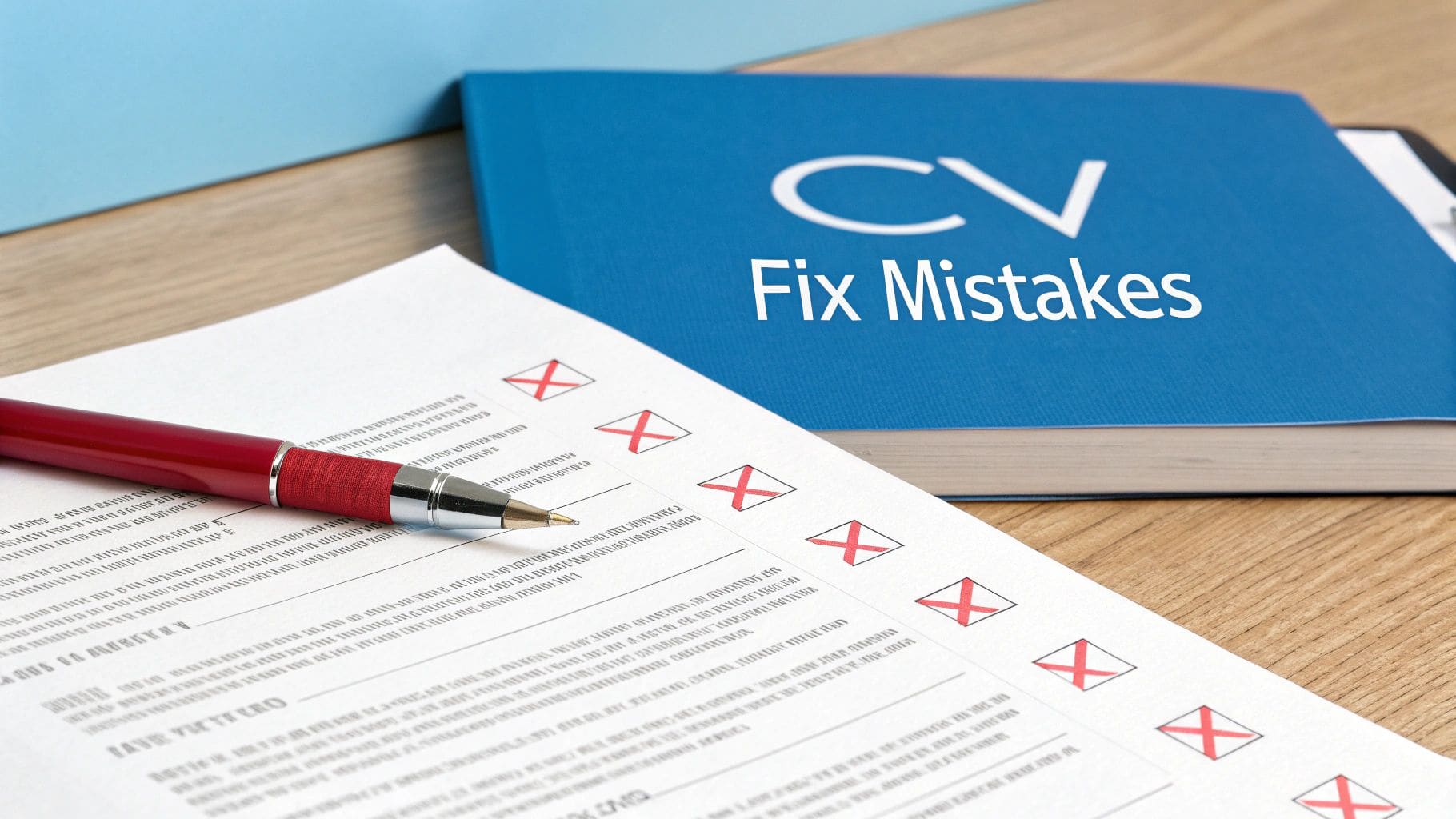
Your Essential CV Checklist for the UK Market

Before you even start typing, let's get the fundamentals right. The visual design and structure of your CV are just as critical as the words you choose. A messy, poorly formatted document can get you rejected in seconds, no matter how qualified you are. This checklist is your no-nonsense guide to getting it right from the start.
Thinking about how a CV should look really comes down to one thing: clarity. Recruiters are skimming for signals—proof of top-tier experience, the right skills, and measurable impact. Your job is to make those signals impossible to miss.
The Foundation of a Strong CV
In the UK, the reverse-chronological format is still king. There's a good reason for this—it puts your most recent, and therefore most relevant, experience right at the top where hiring managers expect to see it.
Never underestimate the power of whitespace. Along with clear, bold headings like 'Work Experience' and 'Education', it makes your CV incredibly easy to read. These elements act as signposts, guiding the reader through your career story without causing fatigue. The content is what sells you, but the presentation is what gets you their attention in the first place. For more expert guidance on polishing your final draft, our tips on a comprehensive CV review can really help.
Your CV must have these core sections. They are absolutely non-negotiable:
- Contact Information: Your full name, a professional email address, your phone number, and a link to your LinkedIn profile.
- Professional Summary: A short, sharp paragraph (think 3-4 lines) at the top, summarising your key skills and biggest wins.
- Work Experience: A detailed history of your roles, but focused on your results and achievements, not just a list of duties.
- Education: Your academic qualifications, also listed in reverse-chronological order.
- Skills: A dedicated section for your most relevant technical and soft skills.
A great CV doesn't just list what you did; it proves what you can do. Each bullet point should be a mini-case study of your success, showing a future employer the value you bring. Getting this right is the secret to knowing how a CV should look.
To give you a quick reference before you dive in, here's a table summarising the essential rules for an effective UK CV.
At-a-Glance CV Formatting Rules
| Element | Best Practice | Why It Matters |
|---|---|---|
| Length | 1 page for early career, max 2 pages for experienced professionals. | Recruiters have limited time. A concise CV respects that and focuses on impact. |
| Font | Professional sans-serif like Arial, Calibri, or Verdana, size 10-12pt. | Ensures readability on all devices and avoids distracting from your content. |
| Format | Reverse-chronological, with your most recent experience first. | This is the standard UK convention and what hiring managers expect to see. |
| Headings | Clear, bold headings for each section (e.g., Work Experience, Skills). | Helps recruiters quickly find the information they are looking for. |
| Margins & Spacing | 1-inch (2.54cm) margins; 1.15 line spacing. Use whitespace strategically. | Prevents a cluttered look, improves scannability, and makes the text easier to read. |
| File Type | Save and send as a PDF. | Locks in your formatting so it looks the same on any computer or device. |
| Colour | Black text on a white background. Use a single accent colour sparingly if needed. | Professionalism and readability are key. Overly colourful CVs can be distracting. |
Stick to these guidelines, and you'll have a solid foundation for a CV that looks professional, passes the initial screening, and gets your skills the attention they deserve.
Is your CV actually getting responses?
Your CV might be missing something important
Upload your CV → see its weakest areas → fix them, one by one.
Free. Takes less than 2 minutes.
What Recruiters Actually Look For in the First 10 Seconds

Let's be blunt: your CV has a terrifyingly short window to make an impact. Recruiters are drowning in applications and make snap judgements in seconds. I've seen it happen time and time again. They're not reading every word; they're scanning for relevance.
To grab their attention, your most potent qualifications have to be right at the top, impossible to miss. Your professional summary, latest job, and core skills need to leap off the page. Thinking about how a CV should look isn't about being fancy—it's about creating a clean, logical path that guides their eyes straight to what matters. Dense text or a confusing layout is a fast track to the 'no' pile.
The Power of the Professional Summary
Think of your professional summary as your elevator pitch. It's the very first thing a recruiter reads and your one real chance to make them slow down and pay proper attention. This short paragraph has to be packed with value, driven by strong action verbs and, most importantly, measurable achievements.
Don't just say you're a "results-driven manager." Prove it.
Instead, write something like: "Senior Project Manager with 8+ years of experience leading cross-functional teams to deliver complex software projects 15% under budget." This instantly communicates your seniority, expertise, and quantifiable impact. It's the hook that makes them want to read on.
In a market where permanent candidate availability has surged, this first impression is everything. Recruiters often spend a mere 10 seconds on that initial scan. A strong, quantified professional summary is your best defence.
Making an Immediate Impact "Above the Fold"
The term "above the fold" comes from old-school newspapers—it's the top half of the front page you see when it's folded. For your CV, this is the top third of the first page. It's prime real estate, and it has to contain your most impressive, relevant information.
To get this right, make sure these elements are clearly visible without scrolling:
- Your Name and Contact Details: Professional and easy to spot.
- A Powerful Professional Summary: Your concise, achievement-focused pitch.
- Key Skills Section: A bulleted list of your most relevant technical and soft skills.
- Your Most Recent Role: Company, job title, and dates of employment.
By putting this information front and centre, you answer the recruiter's most urgent questions straight away. They can see who you are, what you do, and what you've accomplished recently without having to hunt for it. You can learn more about what recruiters look for in resumes in our detailed guide.
A recruiter's initial scan is a search for relevance. They're looking for keywords, job titles, and skills that match the role. A CV that looks well-organised and places this information front and centre is far more likely to get a thorough read.
Why a Clean Layout is Non-Negotiable
A clean, organised layout isn't just about looking good; it's about psychology. A cluttered CV creates cognitive friction, making it harder for a recruiter to process the information quickly.
Use clear headings, consistent formatting, and plenty of white space. Short paragraphs and bullet points are your best friends—they break up the text and make your accomplishments easy to digest. Avoid those dense, intimidating walls of text that do nothing but hide your achievements.
Ultimately, the answer to "how should a CV look?" is always professional, clear, and scannable.
Building Your CV From the Ground Up
Think of your CV as a story. A well-built house needs a solid foundation and a logical layout, and it's the same for your CV. Every section must work together to guide a recruiter through your professional journey, proving your value at every step. This all starts with the essentials: a clean header, a powerful summary, and an experience section that screams achievement.
We'll walk through each critical part, from your contact details right down to optional elements like projects or volunteering. The goal is to turn a simple list of jobs into a persuasive narrative that answers one key question: how should a CV look to make the biggest impact in the UK job market?
Starting Strong: The Professional Header and Summary
Your header is the simplest part of your CV, but it's also one of the most critical. It needs to be clean, professional, and impossible to miss at the top of the page. Stick to the basics: your full name, phone number, a professional email address (leave the old nicknames behind), and a link to your polished LinkedIn profile.
Right below that sits your Professional Summary. This is your elevator pitch. In just 3-4 lines, it needs to grab a recruiter's attention by showcasing your most impressive skills and results. This isn't a vague objective statement; it's a hard-hitting snapshot of the value you bring.
- For a recent graduate: "First-Class Honours graduate in Marketing from the University of Manchester with hands-on experience in SEO and content creation from a competitive internship. Proven ability to increase social media engagement by 45% for a university society campaign."
- For a career changer: "Experienced Retail Manager with 7+ years in team leadership and operations, now seeking a Project Coordinator role. Certified PRINCE2 Practitioner with a track record of managing inventory projects that reduced waste by 20%."
Detailing Your Work Experience with the STAR Method
This is the heart of your CV. To make your experience count, you have to show outcomes, not just list duties. The best way to frame your accomplishments is by using the STAR method (Situation, Task, Action, Result). You don't need to write out the labels, but using it as a mental framework forces you to focus on the impact you made.
So instead of writing:
- "Responsible for managing social media accounts."
You use the STAR method to create something much more compelling:
- "Increased Instagram follower engagement by 30% in six months (Result) by developing and executing a new content strategy based on audience analytics (Action) to revitalise the company's online presence (Task)."
Every bullet point should kick off with a strong action verb and, whenever you can, include a measurable result. Numbers—whether it's percentages, money saved, or time cut—give concrete proof of what you've achieved. This kind of clarity is non-negotiable in today's market, where transparency is key. For example, job ads that show a salary attract 60% more applications, building trust in a market where the average salary is climbing.
Drafting this section can feel like a slog. One practical tip is to use tools like voice typing in Google Docs to get your initial thoughts down quickly. Just speak your accomplishments out loud, then go back and refine the wording. It often makes the writing process feel much more natural.
Presenting Education and Skills Effectively
After you've detailed your work history, the Education section gives important context. Keep it brief. List your qualifications in reverse-chronological order, including the institution, the qualification itself, and your graduation year. There's no need to list every module unless one is exceptionally relevant to the job you're targeting.
Finally, your Skills section gives recruiters a quick, scannable overview of your capabilities. To make it even easier for them to digest, break it down into logical subcategories.
- Technical Skills: Be specific. List the software, programming languages, or tools you know (e.g., Python, Adobe Creative Suite, Google Analytics).
- Soft Skills: Mention abilities like leadership, communication, and problem-solving, but make sure they're backed up with evidence in your experience section.
- Languages: State your proficiency level clearly (e.g., Fluent, Conversational).
A well-structured CV is more than just a document; it's a strategic marketing tool. Every section, from the header to the skills list, should be purposefully designed to highlight your strengths and align with what the employer needs.
By following this structure, you create a CV that's not only easy for a recruiter to read but also tells a compelling and logical story of your professional wins. This is exactly how a CV should look: professional, impactful, and undeniably relevant.
Getting Your CV Past the AI Gatekeepers

Before your CV ever lands in front of a hiring manager, it has to clear a critical first hurdle: the Applicant Tracking System (ATS). Think of it as a digital gatekeeper, the automated software that most companies now rely on to filter applications.
Knowing how a CV should look to an ATS isn't just a good idea anymore; it's the most important first step in any modern job search. These systems are programmed to scan for specific keywords and pull information based on a predictable format. If your CV isn't optimised for them, even the most qualified candidate can get rejected by the machine.
Your goal is to create a document that works for both the software and the human who will hopefully read it next.
In the UK job market, an ATS-friendly CV is completely non-negotiable. A staggering 98% of large organisations use these systems to manage their hiring. This means applications are often rejected automatically if they don't hit the right keyword or formatting criteria, which is exactly why a visually complex CV often fails before a person even sees it.
Decoding How an ATS Reads Your CV
Let's be clear: an ATS doesn't appreciate nuance or creative flair. It's a parsing tool, built to rip out key bits of data—your contact info, work history, skills, education—and dump them into a digital profile. It then scores that profile against the keywords in the job description to decide if you're a potential match.
This means any fancy formatting can throw a spanner in the works. The very elements that look great to the human eye can be a complete disaster for an ATS.
- Tables and Columns: These are notorious for scrambling text. The ATS might read your information out of order or, even worse, miss it entirely.
- Images, Logos, and Graphics: Most systems can't read images. Any text you've cleverly embedded in a logo, like your name or a key skill, will be completely invisible.
- Unusual Fonts: Stick to the classics like Arial, Calibri, or Helvetica. That elegant script font might look great, but it can be unreadable to the software.
- Headers and Footers: Information tucked away in the header or footer of a document often gets skipped. Always put your crucial contact details in the main body of the page.
The golden rule for ATS optimisation is simplicity. Your CV's design needs to be clean, logical, and straightforward. Prioritise clear communication over creative expression—that's fundamentally how a CV should look to a machine.
Practical Steps for ATS Optimisation
Making your CV machine-readable doesn't mean you need to be a tech wizard. It's really about being strategic with your formatting and language. You're essentially translating your experience into a language the ATS can easily process.
The best place to start is by mirroring the language in the job description. Pinpoint the key skills, qualifications, and responsibilities they've mentioned, then weave them naturally into your professional summary and work experience bullet points. This keyword alignment is the single most important factor for passing that first scan.
For a much deeper dive on this, check out our guide on how to create a top-scoring ATS-friendly CV for the UK market.
Using Standard Section Headings
Another critical point is to use conventional section headings. The ATS is programmed to look for standard titles so it can categorise your information correctly.
This isn't the place for creative flair. Avoid titles like "Where I've Been" or "My Superpowers." Stick to the universally recognised headings the software is built to expect:
- Work Experience (or Professional Experience)
- Education
- Skills
- Certifications
This one simple change ensures the system files your job history under "experience" and your degrees under "education." Getting this wrong can make the ATS think you have no relevant background, triggering an instant rejection. By focusing on these small technical details, you make sure your achievements actually get seen by the people who matter.
Tailoring Your CV for Every Application
Firing off a generic CV is the fastest way to get your application ignored. The real secret to showing a recruiter you're the perfect fit? Customisation. It's all about dissecting each job description, pulling out the most important skills and duties, and then echoing that exact language in your CV. Getting this right is fundamental to understanding how a CV should look to make a real impact in 2026.
This doesn't mean you need to invent a new career history for every role. Far from it. Instead, it's about making smart, strategic tweaks. You'll want to adjust your professional summary, shuffle your bullet points to put the most relevant achievements front and centre, and make sure your skills section is a direct reflection of what the employer is asking for. A tailored CV shows you've done your homework and, crucially, makes the recruiter's job much easier.
Decoding the Job Description
Before you touch a single word on your CV, your first job is to become an expert on the role. Don't just skim the job description—read it two or three times. As you go, highlight or copy out the key phrases, requirements, and responsibilities that jump out.
I find it helps to sort these findings into three simple categories:
- Essential Skills & Qualifications: These are the deal-breakers. Look for specific software ("proficient in Salesforce"), methodologies ("experience with Agile"), or qualifications ("PRINCE2 certification required").
- Key Responsibilities: What will you actually be doing all day? Pay close attention to the action verbs they use, like "manage," "develop," "analyse," or "implement."
- Company Values & Language: Get a feel for the company's tone. Are they all about being "innovative," "collaborative," or "data-driven"? This is your window into their culture.
Once you've done this, you have a blueprint for customisation. You've created a checklist of exactly what the employer wants to see.
Mirroring Language and Highlighting Relevance
With your blueprint in hand, it's time to start editing. The goal is to mirror the employer's language and prioritise the information that speaks directly to their needs.
Your Professional Summary is the first place to start. This is prime real estate and should be tweaked for every single application. If the job advert is crying out for "stakeholder management," make sure that exact phrase features prominently in your summary.
Next up is your Work Experience section. Look at the bullet points under your most recent roles. Your task here is to reorder them so the achievements most relevant to this specific job are right at the top of the list for that position. For instance, if you're a Marketing Manager applying for a heavily data-focused role, a bullet point about analysing campaign metrics should absolutely sit above one about creative brainstorming. Our guide on how to tailor your CV for a specific job application dives much deeper into these strategies.
Think of your CV as your personal marketing document. Applying the same principles used for effective marketing materials can totally change how a potential employer perceives your skills and achievements.
A Real-World Scenario
Let's take a Software Developer who has experience in both front-end and back-end tech. They're applying for a role that is 90% focused on front-end development with React.
- Generic CV Approach: Their skills section lists Python, Java, JavaScript, and React, but in no particular order. Their project descriptions talk about database management and UI development with equal emphasis.
- Tailored CV Approach: They take five minutes to edit their skills section, putting JavaScript and React right at the top. They rephrase their project bullet points to lead with the user interface outcomes, mentioning how they "developed a responsive user interface using React that improved user engagement by 25%."
That small change makes a massive difference. It immediately signals to the recruiter that this candidate's strengths are a perfect match for what the role demands. It's a simple but incredibly powerful shift that shows exactly how a CV should look: like it was written just for them.
Common CV Mistakes That Cost UK Candidates Interviews
You can spend hours structuring your CV, tailoring the content, and getting the layout just right. But all that hard work can be undone in a split second by one sloppy mistake. I've seen it happen time and again—even the most qualified candidates get binned because of a simple error that screams a lack of attention to detail.
Knowing how a CV should look isn't just about picking a good template. It's about executing it flawlessly. Recruiters are drowning in applications and often look for quick reasons to shrink the pile. A stray typo or an unprofessional email address is an easy red flag that can cost you an interview before anyone even reads about your fantastic experience.
Spelling and Grammatical Errors
This is the big one. It's hands-down the number one reason a good CV gets rejected. If your CV is riddled with typos or poor grammar, the recruiter sees a careless attitude and questions the quality of work you'd produce. It's an instant credibility killer.
Always proofread your CV. Twice. Then, find a friend or family member with a sharp eye for detail and get them to read it over. My best tip? Read it out loud to yourself. It feels a bit strange, but it's a brilliant trick for catching awkward phrasing and mistakes your brain automatically corrects when reading silently.
Including Irrelevant or Unprofessional Information
Certain details just don't belong on a modern UK CV. Including them wastes precious space and, worse, makes you look out of touch with current professional standards.
- Photographs: Unlike in some countries, photos are a no-go on UK CVs. They can introduce unconscious bias and are widely considered unprofessional here.
- Full Address: You only need your town and the first part of your postcode (e.g., "Manchester, M1"). Your full street address is unnecessary and creates a potential security risk.
- Date of Birth or Marital Status: This information has zero bearing on your ability to do the job and is protected under UK equality laws. Leave it out.
The most effective CVs are ruthlessly relevant. Every single word and section should serve one purpose: to prove you are the best candidate for this specific job. Anything that doesn't contribute to that goal should be cut.
Using Empty Buzzwords and Clichés
Phrases like "team player," "hard-working," and "results-oriented" are so overused they've become meaningless filler. They are empty claims with no proof. The key to understanding how a CV should look is to show, not just tell.
Instead of just stating you're a "great communicator," give a concrete example that proves it. Try something like: "Presented monthly performance reports to senior stakeholders, leading to a 15% increase in departmental funding." This transforms a vague cliché into a tangible, impressive achievement.
Poor Formatting and Design Choices
The visual presentation of your CV sends a powerful message before a single word is read. If it's messy or hard to scan, it's going straight to the 'no' pile.
Here are a few common formatting blunders I see all the time:
- Being Too Long: Stick to a maximum of two pages if you're an experienced professional. If you have less than 10 years of experience, one page is more than enough.
- Using Distracting Fonts: Ornate, quirky, or overly playful fonts have no place on a professional CV. Stick with clean, sans-serif options like Arial, Calibri, or Helvetica.
- Unprofessional Email Addresses: An email like
partyboy89@email.comwill get your application deleted in a heartbeat. Create a simple, professional address, ideally in the format offirstname.lastname@email.com.
CV Mistake and Fix-It Checklist
Before you hit 'send' on any application, run your CV through this quick checklist. It's a simple way to catch those common errors that can make all the difference.
| Common Mistake | Why It's a Problem | How to Fix It |
|---|---|---|
| Spelling/Grammar Errors | Suggests carelessness and a lack of professionalism. | Proofread twice, use a grammar checker, then have someone else read it. |
| Including a Photo | Unprofessional in the UK and can lead to unconscious bias. | Remove it completely. Let your skills and experience speak for themselves. |
| Generic Buzzwords | Phrases like "team player" are empty without proof. | Replace clichés with specific examples and quantifiable achievements (e.g., use numbers). |
| Overly Long CV | Recruiters won't read it; shows an inability to be concise. | Edit ruthlessly. Aim for 1 page (under 10 years' experience) or 2 pages (over 10). |
| Unprofessional Email | Gives a terrible first impression and suggests immaturity. | Create a new, professional email like Firstname.Lastname@email.com. |
| Poor Readability | Tiny fonts or crowded layouts make it hard to scan. | Use a clean font (size 10-12), 1-inch margins, and plenty of white space. |
Think of this table as your final quality check. Spending just five minutes reviewing these points can be the difference between getting an automated rejection and landing that interview.
Frequently Asked Questions About CV Formatting
We've covered the big principles, but it's often the small details that cause the most stress when you're finalising your CV. Getting these right is a huge part of understanding how a CV should look to impress in the UK job market.
Here are some quick, clear answers to the questions we hear most often from job seekers. These points usually touch on UK-specific rules that can easily trip people up, especially around personal details and length.
Should a UK CV Be One or Two Pages?
For almost everyone—from recent graduates to professionals with under 10 years of experience—a sharp, focused one-page CV is the gold standard.
A two-page CV is perfectly fine for senior leaders, academics, or technical specialists who have a long list of relevant projects or publications. Just never go over two pages. For a more detailed breakdown, you can learn more about how long a UK CV should be.
Do I Need to Include a Photo on My CV in the UK?
Definitely not. In fact, you should make sure you don't include a photograph on your CV for any job in the UK.
This is a firm professional standard designed to prevent unconscious bias in the hiring process. Adding a photo can make your application seem unprofessional and out of touch with UK business culture.
What Is the Best Font to Use for a CV?
Stick to the classics. Professional, easy-to-read fonts like Arial, Calibri, or Helvetica are your best bet.
Keep the font size between 10 and 12 points. Avoid anything too decorative or script-like that's hard for a recruiter—or an Applicant Tracking System (ATS)—to read. The wrong font choice can seriously undermine how your CV is perceived by screening software.
Should I Include Hobbies and Interests on My CV?
This is an optional extra, and you should only include it if it adds genuine value. For example, mentioning a personal coding project for a software developer role is a great idea.
If you have very little work experience, a well-chosen hobby can be a clever way to hint at soft skills like teamwork or determination. But if you do include it, keep the section short, sharp, and professional.
Ready to create a CV that gets noticed for all the right reasons? The CV Anywhere Smart CV Builder helps you craft a polished, ATS-friendly document in minutes. From AI-enhanced summaries to job-specific skill alignment, our tools ensure your CV looks professional and makes an impact. Start building your perfect CV for free.
Tags
Related articles
How to write a CV for a job application: The Ultimate UK Guide for 2026
Learning how to write a CV for a job application in the UK is about creating a powerful, targeted sales pitch that proves your value in seconds. To do this effectively, you must start with a compellin...
A Modern Guide to the 1 Page CV Format UK for 2026
A 1 page CV format is a concise, single-page document that strategically showcases your most relevant skills, experience, and qualifications, making it the gold standard for most UK job seekers in 202...
How to Make a CV Stand Out in the UK for 2026
To make a CV stand out, you need to capture a recruiter's attention in the first seven seconds. In the competitive 2026 UK job market, this means tailoring the top third of your CV to be an undeniable...
A Winning Finance CV Format for the UK Job Market in 2026
The best finance CV format UK recruiters want to see in 2026 is a clean, reverse-chronological document, ideally one page long (two is acceptable for extensive experience). The key to success is a lay...
Popular Articles
Learning how to write a CV for a job application in the UK is about creating a powerful, targeted sales pitch that proves your value in seconds. To do this effectively, you must start with a compellin...
A 1 page CV format is a concise, single-page document that strategically showcases your most relevant skills, experience, and qualifications, making it the gold standard for most UK job seekers in 202...
To make a CV stand out, you need to capture a recruiter's attention in the first seven seconds. In the competitive 2026 UK job market, this means tailoring the top third of your CV to be an undeniable...
The best finance CV format UK recruiters want to see in 2026 is a clean, reverse-chronological document, ideally one page long (two is acceptable for extensive experience). The key to success is a lay...